
Redesigning a Web3 gaming website to improve clarity, trust, and user conversion.
I redesigned and rebuilt the WNDR Super App website to fix its biggest issues — unclear messaging, low trust, and high drop-off.
As the only designer, I handled UX, UI, content strategy, and front-end build in Framer, working closely with the PM and developer to ship a site that finally communicated what the product actually does.
Visit live website
WNDR is a Web3 gaming platform that lets users buy, store, and use digital assets across games. The previous site looked modern but failed at the core job: users couldn’t understand what the product actually did — and in Web3, confusion instantly kills trust.
I redesigned and rebuilt the entire website to communicate value clearly, reduce fear, and improve conversion. As the only designer, I handled UX, UI, content strategy, and the full Framer build using component systems and code overrides.
The Problem
WNDR targets gamers, streamers, and Web3 enthusiasts, but the original website failed at the most critical job of a landing page: Helping new visitors understand what the product is, why it matters, and why they should trust it within the first few seconds.
At first glance, the site looked generic and vague:
No clear value proposition
No strong differentiation from competitors
No trust signals
No clarity on rewards, safety, or ownership
In a market where users are already highly skeptical, this created immediate scam perception, confusion, and early drop-offs.
People don’t read — they scan. And what they saw wasn’t enough to stay.
Discovery & Validation
Before redesigning anything, I ran quick validation tests. I shared the website with:
A neutral user unfamiliar with Web3
A user experienced with Web3 products
Both dropped off in under 20 seconds. Their feedback was blunt:
“I don’t understand what this is.”
“It feels like another crypto scam.”
“All I know is that it’s something about gaming.”
This confirmed the core problem: The website wasn’t failing visually, it was failing strategically.
The issue wasn’t aesthetics. It was messaging, structure, and trust.
Project Constraints
This project ran under real startup constraints:
Team:
1 designer (me), 1 engineer, 1 PM (also the CTO), founder, 1 3D artist
Tools:
Designed in Figma, implemented fully in Framer and I used custom code components and overrides for interactions
Business constraints:
The Founder and CTO had specific messaging goals that had to resonate with Web3 users
The product was still evolving, so copy had to balance clarity with flexibility
Time & resources:
No dedicated research team,
No analytics pipeline at the start
Iterations had to be fast and impact-driven
This meant every design decision had to be high leverage.
Design Decisions & Trade-offs
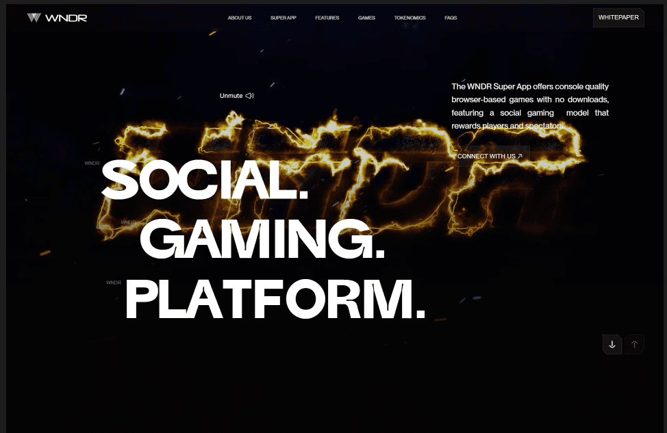
1. Replacing the Hero Section
Problem: The hero used a static image and generic copy.
Decision: Replace it with a gameplay video and rewrite the copy entirely.
Why:
Movement instantly communicates product reality
Shows the actual experience instead of abstract promises
Reduces cognitive load for first-time users
Trade-off:
Heavier asset, but worth it for clarity and engagement.
Before
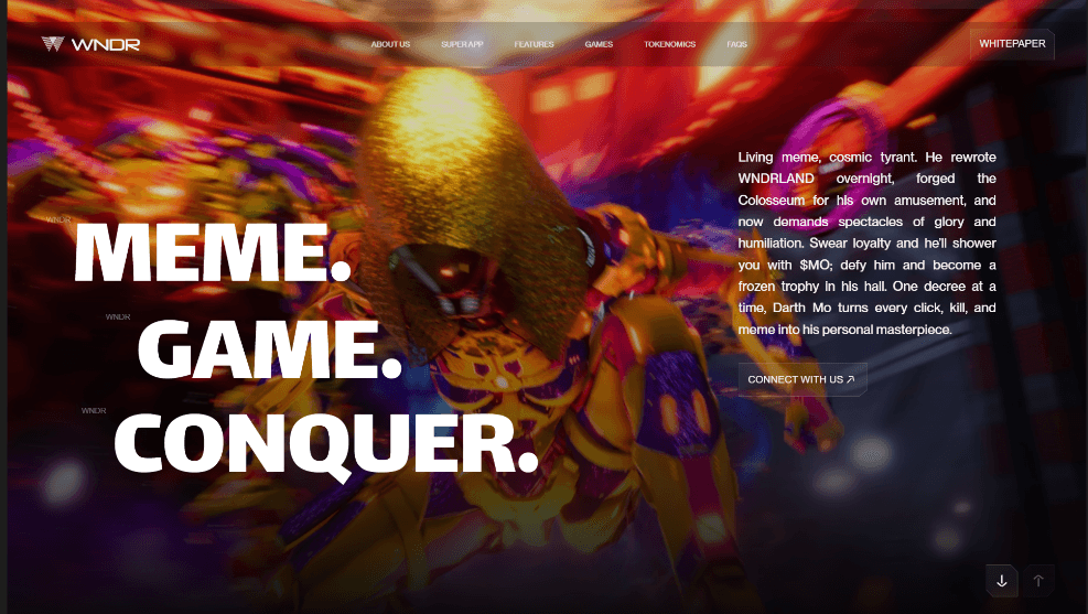
After
2. Rewriting the Entire Website Copy
I rewrote copy from hero to footer. The focus on:
Clear value proposition
Concrete benefits (not buzzwords)
Simple language for scanning behavior
Reduced crypto jargon
This shifted the site from “We’re building something cool in Web3” to “Here’s what you get, why it matters, and how to start.”
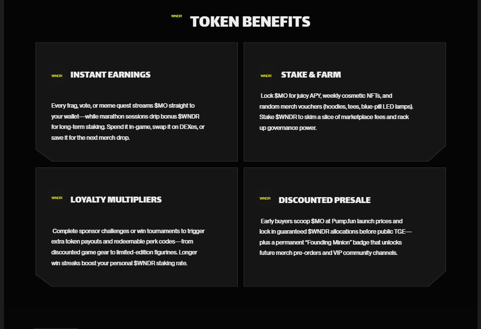

3. Introducing Trust & Transparency Elements
To fight scam perception, I added:
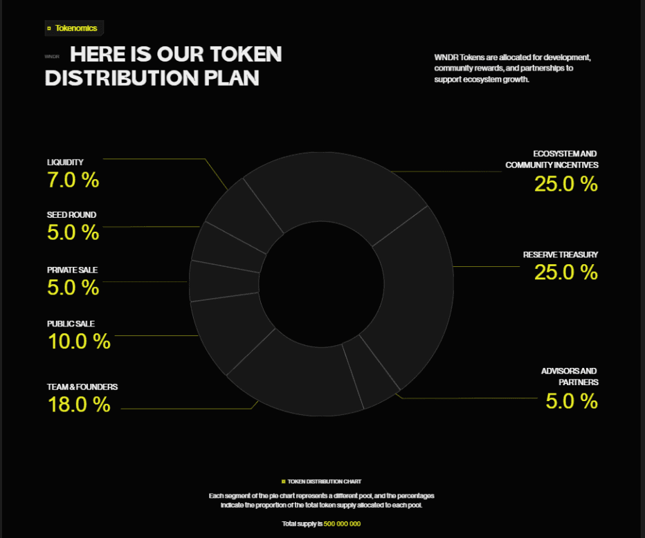
Token distribution chart (fund allocation clarity)
Clear onboarding steps
Roadmap structure
Product visuals (GIFs + screenshots per section)
Why:
In Web3, lack of transparency kills conversion faster than bad UI.
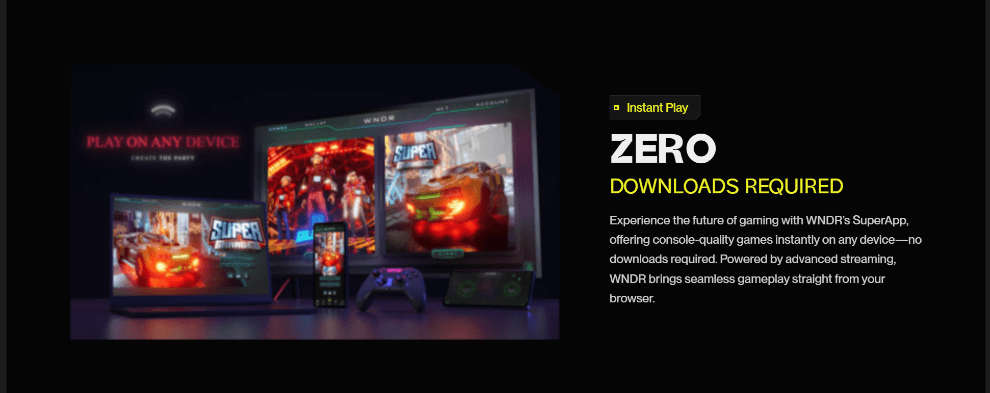
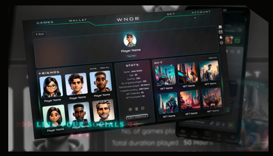
4. Showing the Product, Not Just Talking About It
Each section included:
Gameplay visuals
Feature demonstrations
Contextual explanations
This allowed users to mentally simulate the product instead of guessing.


Results & Impacts
Before redesign:
< 500 total users
High bounce rate
Low trust and engagement
After launch:
1,500+ sign-ups in the first week
6,000+ sign-ups within one month
Retention improved by 30%
Clear increase in product understanding and positive feedback
The redesign directly shifted the website from:
“Looks interesting but I don’t trust it” to “I understand this and I want to try it.”
What This Project Taught Me
Working on WNDR reinforced a few truths:
Clarity beats aesthetics, especially in Web3 and fintech.
Trust needs to be designed intentionally across visuals, content, and motion.
Being the only designer grows your problem-solving instincts fast.
Shipping in Framer gives you a superpower: design + build = speed & control.
Good collaboration with PMs and developers makes everything sharper.
ROLE:
RESULTS:
+65% increase in conversion
+31% increase in retention rate
4x sign-up rate
TEAM
TOOLKIT:


Contact Me
+ 234 902 0787 557
All rights reserved, all wrongs denied.

